SpreadsheetInput Control
Description
Displays a spreadsheet style grid for editing values.
Discussion
The SpreadsheetInput Control allows you to display a spreadsheet style grid of cells in which the user can enter/edit data. The spreadsheet columns can be resized and also reordered.
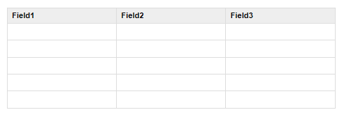
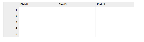
For example, in the image below, a SpreadsheetInput Control has been defined with 3 columns and 5 rows. The user can use keyboard navigation (tab, shift-tab, up and down ) to move between the cells in the control.
When the UX is submitted, the data in the control is submitted as a JSON string.
For example, if the control had been filled in as shown below:
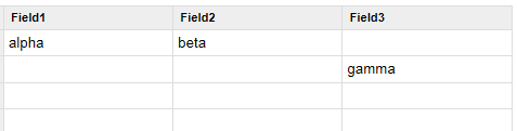
then, when the UX was submitted, the data submitted for the SpreadsheetInput control would be as string with this value:
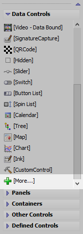
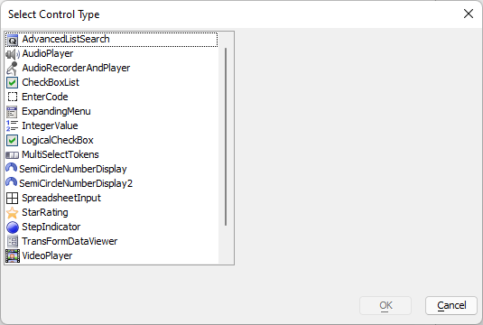
"[{"field1":"alpha","field2":"beta","field3":""},{"field1":"","field2":"","field3":"gamma"}]"To, add a SpreadsheetInput control to a UX, select the [More..] control from the Data Controls section of the UX toolbox.
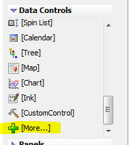
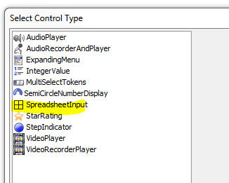
Then select the SpreadsheetInput control from the list.
To configure the control, click the smart field for the Control properties.
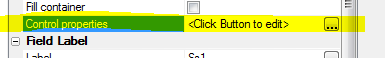
This will open the genie where you can configure the control.
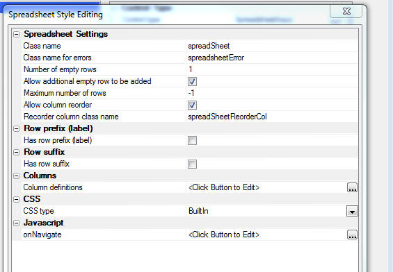
The most important property to configure is the Column definitions property. This property allows you to define the columns shown in the SpreadsheetInput control.
Click the smart field to open the editor, as shown in the image below.
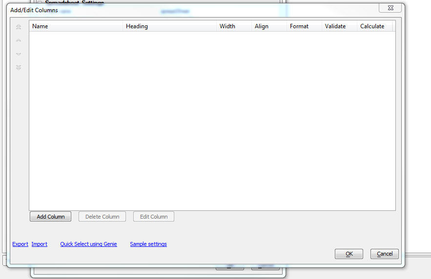
You can add columns one at a time by clicking the Add Column button. You can click the Quick Select using Genie hyperlink to add columns to match the fields in a SQL table.
The onNavigate property allows you to specify Javascript code to execute when a cell in the control gets focus.
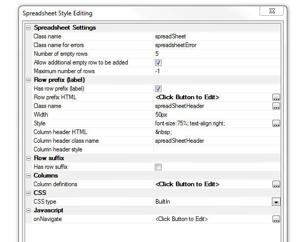
Defining Row Prefixes and Suffixes
You can define row prefixes (i.e. row labels) and row suffixes so that the control looks even more like a spreadsheet. The prefix displays at the left side of each row and the suffix displays at the right edge of each row. For example, in the image below a prefix has been defined to show the row number.
Here is how the control is configured to show the prefix:
The Has row prefix (label) property is checked.
The Row prefix HTML is a defined using Javascript code that can reference row - the zero based row number and data - the array of data with which the control is populated. To show the row number as the row prefix, the Javascript for the Row prefix HTML is set to:
return (row + 1);
The Width property is set to 50px to set the width of the prefix column.
The Style property is set to font-size: 75%; text-align: right; to make the font slightly smaller than the text in the input control and also to right align the text in the row labels.
Methods
Since the SpreadsheetInput control is a standard UX Data Control, you can use the {dialog.object}.setValue() method to populate the cells in the control with data and the {dialog.object}.getValue() method to get the data in the control. When you use these methods, the value is a JSON string.
For example, if the SpreadsheetInput control has 3 columns (field1, field2 and field3), you could use the following Javascript to populate the control:
var _data = [
    {field1: 'alpha', field2: 'beta'},
    {field2: 'gamma', field3: 'delta'},
    {field3: 'epsilon'}
];

var _string = JSON.stringify(_data);
{dialog.object}.setValue('mySpreadsheetControl',_string);
.setColumnAndPopulate() Method
You can also dynamically change the columns shown in the control to match the columns in some data with which you want to populate the control. For example, say that the SpreadsheetInput control was initially configured to show a single column (say 'Field1') and you wanted to populate it with the following data:
[
    {firstname: 'John', lastname: 'Smith', city: 'London'},
    {firstname: 'Harry', lastname: 'Jones', city: 'Boston'},
    {firstname: 'Winston', lastname: 'Flowers', city: 'Harare'}
]
You can call the control's .setColumnsAndPopulate() method.
For example:
var obj = {dialog.object}.getControl('mySpreadsheetControl');

var _data = [
    {firstname: 'John', lastname: 'Smith', city: 'London'},
    {firstname: 'Harry', lastname: 'Jones', city: 'Boston'},
    {firstname: 'Winston', lastname: 'Flowers', city: 'Harare'}
]

obj.setColumnsAndPopulate(_data);
The columns shown in the control will now be 'firstname', 'lastname' and 'city'.
.getState() and .setState() Methods
Since the columns in the Spreadsheet input control are resizeable and reorderable, you might want to capture the state of the Spreadsheet input control's column layout so that you can restore it the next time the user runs the component.
For example
var obj = {dialog.object}.getControl('myspreadsheetcontrol_1');
'get the spreadhseet control state as a JSON string
var json = obj.getState();

'store in local storage
localStorage.setItem('spreasheet_01_State',json);
Then, to restore the state
var json = localStorage.getItem('spreasheet_01_State');
var obj = {dialog.object}.getControl('myspreadsheetcontrol_1');
obj.setState(json)
Inserting an Add-in Control
Add-in Controls are inserted using the More... option in the Data Controls section of the UX Builder.
Select the control you would like to add and click OK.
In addition to the controls that ship with Alpha Anywhere, you can also create your own add-in controls. See How to Create Add-in Controls to learn more.
Videos
Using the Spreadsheet Input Control
In certain applications where a user needs to input data quickly, a spreadsheet style data entry control can be very efficient.
In this video we show how you can add a Spreadsheet Input control to a UX component.